
The Psychology of Color in Interior Design: Mastering the Emotional Palette
Your walls can talk, make sure they’re saying the right thing. In the luxury market, we know that color is powerful. It’s not just something we see, it’s something we feel. It sets the tone in a room before you even step in. One glance, and boom which is you’re either instantly calm, oddly energized, or wondering why you suddenly feel like eating cake. (Yes, that’s a real thing. Thank you, red kitchens.)
At Sarah Z Designs, we believe that true luxury lies in the invisible details. In the world of interior design, color isn’t just about choosing what “looks good.” It’s about understanding how color works on a psychological level and how it can transform not just your space, but the way you live in it.
The Emotional Architecture of Your Home
When we approach a new project, we aren’t just selecting paint chips; we are curating the emotional backdrop of your life. This is the intersection of aesthetics and neuroscience.
Decoding the Spectrum
What is color psychology? Color psychology is basically the study of how colors impact human emotions, mood, and behavior. Sounds fancy, right? But it’s really just about tuning into how certain shades make us feel. We utilize standards from the WELL Building Standard to ensure that the chromatic choices we make support your mental well-being. Like:
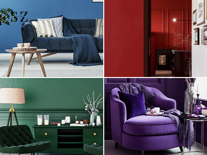
- Blue calms us down – like a lazy Sunday by the ocean. It lowers blood pressure and slows respiration.
- Red wakes us up – it’s bold, passionate, a little dramatic. It stimulates the adrenal gland.
- Yellow is pure sunshine – happy, hopeful, and full of energy. It triggers the release of serotonin.
- Green feels balanced and grounded – like a walk in the woods. It is the easiest color for the human retina to focus on.
- Neutrals? They’re your blank canvas – timeless, clean, adaptable.
When you apply these colors to your home, you’re not just decorating. You’re creating an experience. You are engaging in a dialogue with your environment.
The Function of Feeling
Why does this matter in interior design? Because rooms aren’t just rooms. Your kitchen isn’t just a place to chop onions, it’s the heart of the home. It is where sustenance meets socialization. Your bedroom isn’t just for sleeping, it’s your retreat, your recharge station.
When we understand the psychology of color in interior design, we can:
- Create rooms that feel as good as they look
- Encourage relaxation, creativity, or connection
- Boost mood and productivity
- Build a space that reflects you – your energy, your lifestyle
Color isn’t just the finishing touch. It’s the foundation of how your home feels. It is the first layer of luxury.
Technical Precision Meets Aesthetic Beauty
To truly master the psychology of color, we must look at the science of light. We analyze Light Reflectance Value (LRV)—the percentage of light a paint color reflects—to ensure the mood matches the metric.
Room-by-Room Color Magic:
We tailor the palette to the function of the space, ensuring that the psychology of color in interior design works in your favor.
The Sanctuary of Sleep
-> Bedroom – Blue: The Calm Creator Do you need better sleep? Go blue. Soft, cool blues can lower heart rates and ease anxiety. We often specify shades like Benjamin Moore‘s Hale Navy or lighter, ethereal tones to induce the production of melatonin. Think coastal getaway vibes without the airport security.
The Social Catalyst
-> Dining Room – Red: The Conversation Starter Red brings the energy. It’s warm, social, and it even boosts appetite (there’s a reason so many restaurants use it). While we rarely paint an entire luxury dining room in fire-engine red, we use deep burgundies or terracottas to stimulate conversation. Just go easy, it’s powerful stuff.
The Culinary Engine
-> Kitchen – Yellow: The Morning Mood Booster If your kitchen gets good morning light, yellow will make it glow. It energizes, uplifts, and pairs perfectly with a coffee machine. For a high-end look, we lean towards buttery creams or ochre accents rather than primary yellow.
The Grounding Force
-> Living Room – Green: The Balancer Green is the great equalizer. Biophilic design teaches us that humans have an innate connection to nature. It brings a sense of stability and peace, making it perfect for the space where you unwind, entertain, or binge-watch shows.
The Canvas of Calm
-> Every Room – Neutrals: The MVPs Don’t underestimate beige, ivory, greige, or even moody charcoal. In luxury design, texture is king. Neutrals give you freedom to layer in art, plants, textures, and bold accents without feeling chaotic.
Optimizing Color Performance
To ensure your home performs as beautifully as it looks, we balance the color choice with technical lighting data.
| Room Function | Recommended LRV (Light Reflectance Value) | Ideal Kelvin Temperature (Lighting) | Psychological Outcome |
|---|---|---|---|
| Rest & Retreat (Bedroom) | 40-60 (Mid-tone to Dark) | 2700K (Warm White) | Melatonin production, reduced anxiety, intimacy. |
| Focus & Task (Kitchen/Office) | 60-80 (High Reflectance) | 3000K – 3500K (Bright White) | Alertness, visual clarity, energy boost. |
| Social & Living (Dining/Lounge) | 50-70 (Balanced) | 2700K – 3000K (Soft White) | Comfort, conversation flow, relaxation. |
Future-Proofing Your Aesthetic: Trends & Implementation
The landscape of design is always shifting. Hot Color Trends in Interior Design are moving away from the sterile greys of the past decade.
2025 and Beyond: The Organic Shift
Designers are leaning into palettes that feel like home – warm, organic, and rooted in nature. In 2025, here’s what’s stealing the show:
- Soft sage and sand – Evoking the serenity of the desert.
- Navy blue and warm brass – A classic nautical nod with a metallic edge.
- Blush pink and deep charcoal – Masculine structure meets feminine softness.
- Creamy whites with earthy olive – The new neutral foundation.
- Terracotta and beige – Grounded warmth.
These combos don’t just look good on your Pinterest board, they also work with our brains and bodies to create a mood that lasts.
Strategic Selection: Beyond the Swatch
Tips for Choosing the Right Color Feeling a little lost in the paint aisle? Been there. The difference between a “nice” room and a “stunning” room is often the undertone. Here’s how to bring clarity to your color chaos:
- Think about what the space needs. Rest? Energy? Focus? Define the emotional objective first.
- Pay attention to lighting, natural light changes how colors look. A color that looks warm in the store might look cool in your North-facing living room. We always test with Lutron lighting controls to see how the pigment shifts from day to night.
- Don’t overdo the bolds, balance them with neutrals. Use the 60-30-10 rule for perfect proportion.
- Texture matters too. Think wood, linen, matte finishes. A flat matte paint absorbs light differently than a high-gloss lacquer, altering the color’s perception.
Trust your gut. If you feel good in a color, that’s the one.
The Science of Sanctuary: Color & Cognition FAQ
1. How does Light Reflectance Value (LRV) affect my choice of color in a Miami condo? LRV measures the percentage of light a paint color reflects. In Miami, with our intense sun and floor-to-ceiling windows, a high LRV white can create an uncomfortable glare. We strategically balance natural light exposure with specific LRV metrics to ensure visual comfort and prevent “snow blindness” in bright coastal interiors.
2. Why is “Metamerism” the most critical factor when choosing high-end pigments? Metamerism is the phenomenon where a color shifts depending on the light source. A perfect “greige” selected in a showroom might look greenish under the 4:00 PM Miami sun. We test all palettes under different Spectral Power Distributions (SPD) to ensure your home maintains its sophisticated integrity 24/7.
3. Can I use dark, moody colors in a smaller floor plan without it feeling cramped? Absolutely. By using a “Monochromatic Continuity” technique with low-LRV colors in ultra-matte finishes, we make the boundaries of the walls “disappear,” creating a sense of infinite depth. When paired with a CRI >90 lighting scheme, the space feels intimate and expansive rather than small.
4. How does the Color Rendering Index (CRI) affect my investment in luxury textiles? The CRI of your lighting determines how “true” a color appears. A low CRI will make expensive silks and velvets look muddy or gray. To protect your investment, we specify lighting with a CRI of 90 or higher, ensuring that the rich pigments of your decor are rendered with museum-quality vibrance.
5. Does a scientifically-backed color palette increase property value? Yes. Beyond aesthetics, a home designed with Neuro-aesthetics—the science of how the brain perceives space—creates an immediate emotional connection with potential buyers. A “biologically restorative” home is a high-value asset in the luxury real estate market, as it promises a lifestyle of wellness that standard “decorated” homes cannot match.
Final Thoughts
At the end of the day, color in interior design is about feeling at home, whatever that means to you. It is the backdrop to your memories. Whether you’re drawn to soft neutrals or bold jewel tones, what matters is how the space makes you feel when you walk through the door.
Design isn’t about trends. It’s about creating spaces that reflect your soul and color is the paintbrush you start with.
No in betweens but everything in details you got to know everything you need.
Let your home speak the language of color—soft, bold, and everything in between. Connect with Sarah Z Designs to bring your vision to life through the science and art of design.


