Biophilic Pigments: The Color Science of Low-Cortisol Design
An Executive Technical Report by Sarah Z Designs
The Sarah Z Philosophy: Designing for Biological Integrity
Contemporary luxury is no longer defined by ornamentation alone, but by a space’s ability to regulate the human nervous system. At Sarah Z Designs, we approach interior design as an extension of biology—an applied sensory architecture that supports physiological balance and mental clarity.
Every finish, pigment, and texture is evaluated for its neurological impact. A home is not merely an aesthetic refuge; it is the primary filter through which the body interprets the world. By integrating neuro-aesthetics and biophilic color science into our foundational process, we ensure that our interiors do more than look exquisite—they actively function as tools for physiological recovery, emotional regulation, and sustained focus.
Our work goes beyond decoration. Design, for us, is the act of engineering an environment that resonates with your DNA.
The Biological Imperative of Color
The human eye and brain evolved over millions of years to interpret the precise spectral signatures of the natural world. These visual inputs are directly linked to the endocrine system, influencing hormonal release and nervous system response in real time.
When we inhabit spaces dominated by artificial, high-contrast, or overly saturated synthetic colors, the body interprets the environment as subtly hostile. The result is a persistent, low-level activation of our biological alarm system—manifested through the continuous release of cortisol, the stress hormone.
By contrast, when interiors are enveloped in biophilic pigments, they replicate the safety signals of our ancestral environment. This activates the parasympathetic nervous system and its “rest and digest” response. This biologically informed approach to palette selection is a cornerstone of low-cortisol design and a defining element of the 2026 Miami interior design trends reshaping the South Florida landscape.
The Neuro-Architecture of Color
Neuro-aesthetics examines how the brain responds to aesthetic experience. Contemporary research demonstrates that specific wavelengths of light—particularly those reflected by pigments found in nature—can lower blood pressure, reduce heart rate, and ease cognitive load.
In luxury interior design, this demands rigorous color curation. We are not simply choosing paint. We are selecting the background radiation of daily life.
This consideration is especially critical in Miami, where the exterior environment is dominated by intense, high-Kelvin sunlight and vibrant saturation. For an interior to function as a true sanctuary, it must offer a sensory counterbalance—a cooling, grounding atmosphere that allows the eye and nervous system to rest.
This balance is achieved through the strategic application of low-velocity colors: complex, layered hues that absorb aggressive energy rather than reflect it.
The Chlorophyll Spectrum: Restorative Greens
Green is the color of survival. For our ancestors, abundant greenery signaled water, food, and shelter. As a result, the human eye can distinguish more shades of green than any other color.
In a low-cortisol design framework, we deliberately move away from primary, synthetic greens and toward complex, grey-washed variations: sage, moss, olive, and eucalyptus. These pigments sit at the center of the visible light spectrum, requiring minimal ocular effort to process. When introduced through velvet upholstery, natural stone, or lime-washed walls, they create a subliminal connection to the forest floor—a grounding effect essential for balancing the energy of a high-rise penthouse or expansive coastal estate.
Technical Specifications: Spectral Impact Overview
| Biophilic Pigment Family | Spectral Wavelength (nm) | Biological Response | Luxury Application |
| Deep Oceanic Blue | 450–490 (Short) | Reduces heart rate; enhances depth perception | Velvet drapery, lacquered libraries |
| Restorative Sage | 520–560 (Medium) | Minimal eye strain; cortisol reduction | Artisan lime plaster, linen |
| Warm Sand / Taupe | 580–600 (Neutral) | Mood stabilization; warmth without stimulation | Travertine flooring, raw silk |
| Terracotta / Clay | 590–620 (Muted Long) | Grounds social interaction; stimulates appetite | Dining spaces, leather upholstery |
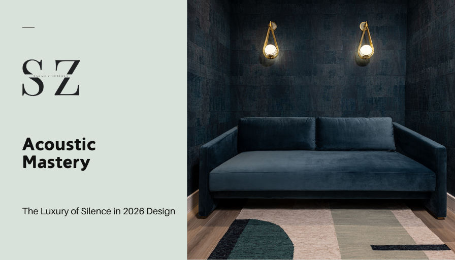
The Oceanic Spectrum: Depth and Calm
Water is the essence of life, and its visual presence exerts a profound calming effect. Yet not all blues produce the same physiological response. In our design philosophy, we favor the depth of the ocean over the brightness of the sky.
Indigo, slate blue, and charcoal-infused teals create a sense of infinite depth, visually expanding boundaries and forming a protective, enveloping atmosphere. To prevent these tones from feeling cold, they are balanced with warm metals—such as brushed brass or bronze—creating a refined tension.
Texture as the Ultimate Pigment
In low-cortisol design, color does not exist in isolation—it is inseparable from texture. A flat, high-gloss beige reads as static; the same hue expressed through raw linen or honed limestone becomes organic and alive.
Biophilia embraces imperfection. By working with materials that carry inherent pigmentation—the veining of Calacatta marble, the grain of walnut, the weave of wool—we introduce fractal fluency into the space. Fractals—patterns that repeat across multiple scales—are processed by the human brain with exceptional ease, significantly reducing cognitive load.
The Role of Light in Color Perception
The phenomenon of metamerism explains why a color changes appearance under different light sources. In a low-cortisol home, color temperature is carefully controlled.
We avoid the clinical blue spike of standard LEDs (4000K–5000K) in favor of warm, dimmable sources (2700K–3000K) that mimic the setting sun. This ensures that biophilic pigments retain their depth and richness after dark.
Frequently Asked Questions (Wellness & Design)
Why is blue light a challenge in Miami coastal homes?
Constant exposure to blue-spectrum light from sky and ocean can overstimulate the nervous system. Matte biophilic pigments absorb glare without compromising panoramic views.
How do biophilic pigments reduce cognitive load for executives?
High-contrast synthetic colors force continuous visual correction. Biophilic pigments align with the brain’s natural processing patterns, freeing cognitive resources for focus and decision-making.
Can a minimalist home still be biophilic?
Absolutely. When minimalism emphasizes natural textures—warm stone, wood, and layered off-whites—it mirrors the serenity of a desert landscape, provided depth and tactility are preserved.
Are dark colors compatible with low-stress environments?
Yes. In “yin” spaces such as bedrooms, deep biophilic tones absorb light and recreate the ancestral safety of a cave, signaling the brain to rest.
How is cohesion maintained in open-concept homes?
A refined neutral “through-line” pigment—often a warm greige—anchors architectural elements, while biophilic accents define zones without disrupting visual flow.
The Art of the Sanctuary
Designing a low-cortisol home is an act of preventative healthcare as much as it is an act of design. By surrounding ourselves with the pigments of the earth, we create a buffer against the chaotic frequency of the modern world—a return to our roots, interpreted through uncompromising luxury.
Your home is not a stage. It is a biological system. Designing it well is a form of high-level self-care.
To transform your residence into a vessel of calm and sophisticated biophilic beauty, we invite you to schedule a private design consultation with Sarah Z Designs—where palettes are curated not only to be seen, but to be deeply felt.