Designing in Shades of White: Sarah Zohar Joins the Cloud Dancer Panel
Pantone named a white as Color of the Year for the first time in its history, and the design world has not stopped arguing about it since. On Wednesday, August 12, Florida Design brings three designers together in Lake Worth Beach to talk about what Cloud Dancer actually looks like in a home, and Sarah Zohar has been invited to the table.
By Sarah Z Designs | August 2026 | 6 min read
White is the color everyone assumes is the safe choice, and it is the one that goes wrong most often. Take pigment out of a room and the only things left holding it together are light, texture and proportion. That is the conversation happening this Wednesday, August 12, at Cloud Dancer, a white party and designer panel discussion presented by Florida Design at the Palm Beach Art, Antique and Design Showroom in Lake Worth Beach. The theme is the art of designing in shades of white, and Sarah Zohar has been selected as one of the designers on the panel, alongside Angela Reynolds of Angela Reynolds Design and Sophia Passerini of Passerini Interiors.
The most controversial choice Pantone has ever made
The evening takes its name from Pantone 11-4201 Cloud Dancer, named Color of the Year 2026. It is a soft, billowy white, described by the Pantone Color Institute as a symbol of calming influence in a society rediscovering the value of quiet reflection. What makes the choice remarkable is that Pantone has been naming a color of the year since 1999 and this is the first time it has ever chosen a white.
Judging by the debate on social media, it may also be the most controversial choice Pantone has ever made. Half the design world called it a cop-out, a non-color, an announcement of nothing. The other half recognized it immediately as the most honest reading of the moment in years. That argument, whether a shade of white can carry a real design statement at all, is precisely where the panel begins, and it is an argument Sarah is happy to have. In her view, calling white a non-color misunderstands what color does in a room. White is not the absence of a decision. It is the decision that exposes every other one.
There is also a prediction folded into Pantone’s choice. After years of visual noise, maximalist feeds and rooms designed to photograph rather than to live in, people are asking their homes for clarity, quiet and room to think. Cloud Dancer reads like Pantone naming that cultural shift out loud: a rediscovery of restraint, a craving for tranquility. In interiors that translates into a very specific challenge. A white room is not a room with less design in it. It is a room where every decision is visible, because there is no color left to hide behind.
An honor, and a natural fit
Being invited by Florida Design to speak on the most talked about color story of 2026 is a genuine honor, and it lands close to home. Sarah Z Designs has built its work around light, organic materials and biophilic principles, mostly in oceanfront and high rise residences across Miami, Sunny Isles and Bal Harbour. Those are exactly the conditions in which a white palette either sings or collapses.
The studio has spent years working with lime plaster, pale oak, linen, honed limestone and unglazed ceramic in rooms flooded with reflected ocean light. That is the practical vocabulary behind Cloud Dancer, and it is what Sarah will be bringing to the panel discussion. For her, the emotion this particular white evokes is different from any other shade in the fan deck. Most whites present themselves as backdrops. Cloud Dancer feels like air and early morning light, softness without sweetness, and that quality of calm is exactly what her clients have been asking their homes to deliver.
Inside the conversation: what the panel will actually debate
Florida Design has shaped the evening around the questions every designer, and every homeowner, runs into the moment white enters the project. Here is a preview of the ground the panel will cover, and where Sarah stands on each of it.
“I want white walls.” Now what?
There is no such thing as one white. Most paint manufacturers show somewhere between two and three hundred shades of it, some warm, some cool, some neutral, and nearly all of them carrying an undertone: yellow, blue, green, gray or pink. That undertone is invisible on a two inch paint chip and unmistakable across a full wall. Place two whites with opposing undertones in the same room and one of them will always look dirty. So when a client says they want white walls, the real work is only beginning. The studio’s process starts with the light, not the paint: which direction the rooms face, what the light bounces off, and which undertone family will stay honest through the whole day.
South Florida makes this harder than almost anywhere else. Our light is intense, it bounces off water and pale terraces, and in an oceanfront residence it changes character three or four times between morning and sunset. A white that felt serene in a showroom at noon can turn faintly green by four in the afternoon in a Sunny Isles living room, simply because it is now reflecting the sea. This is why large samples belong on the actual walls, at three different hours, before anything is approved.
How much white is too much?
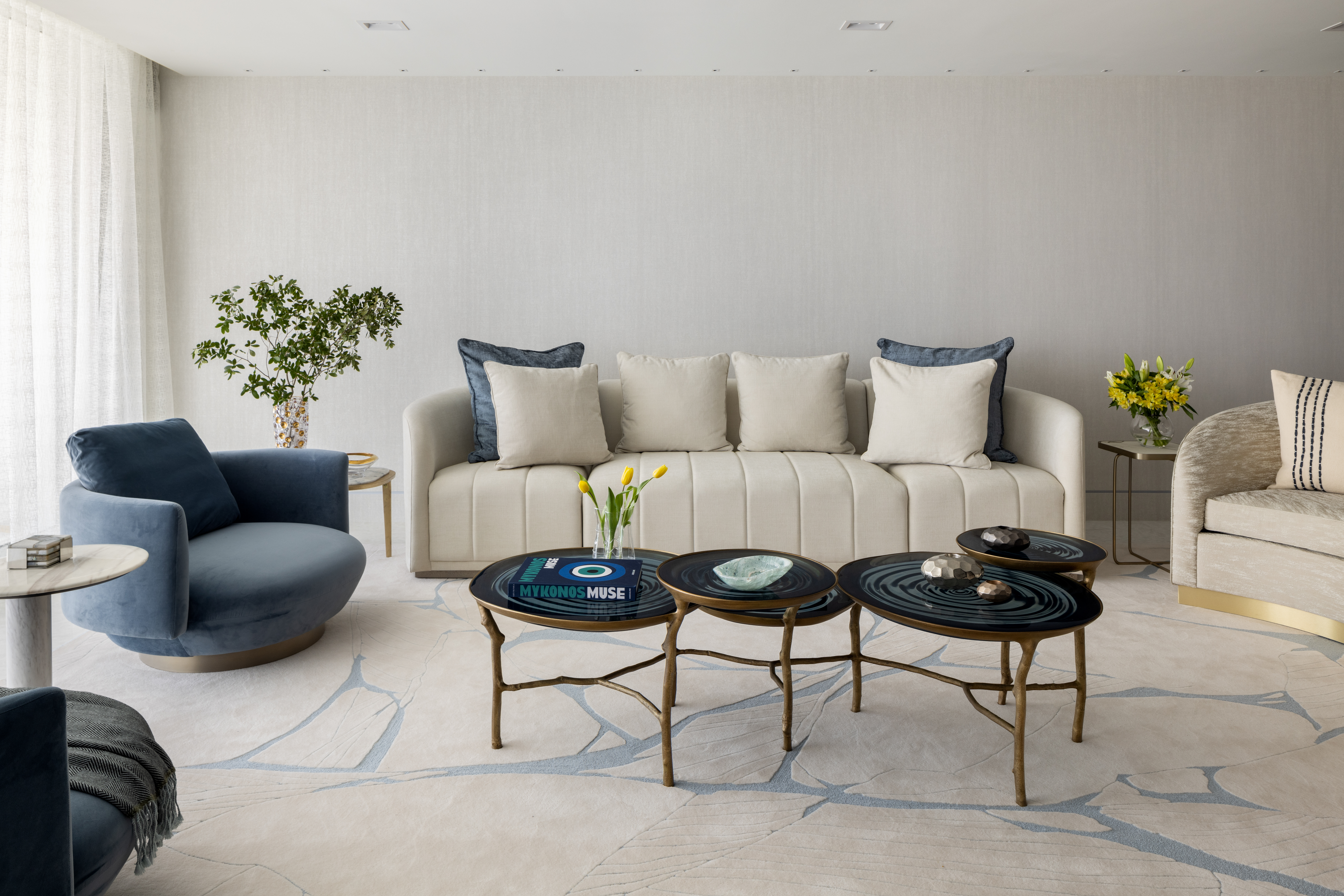
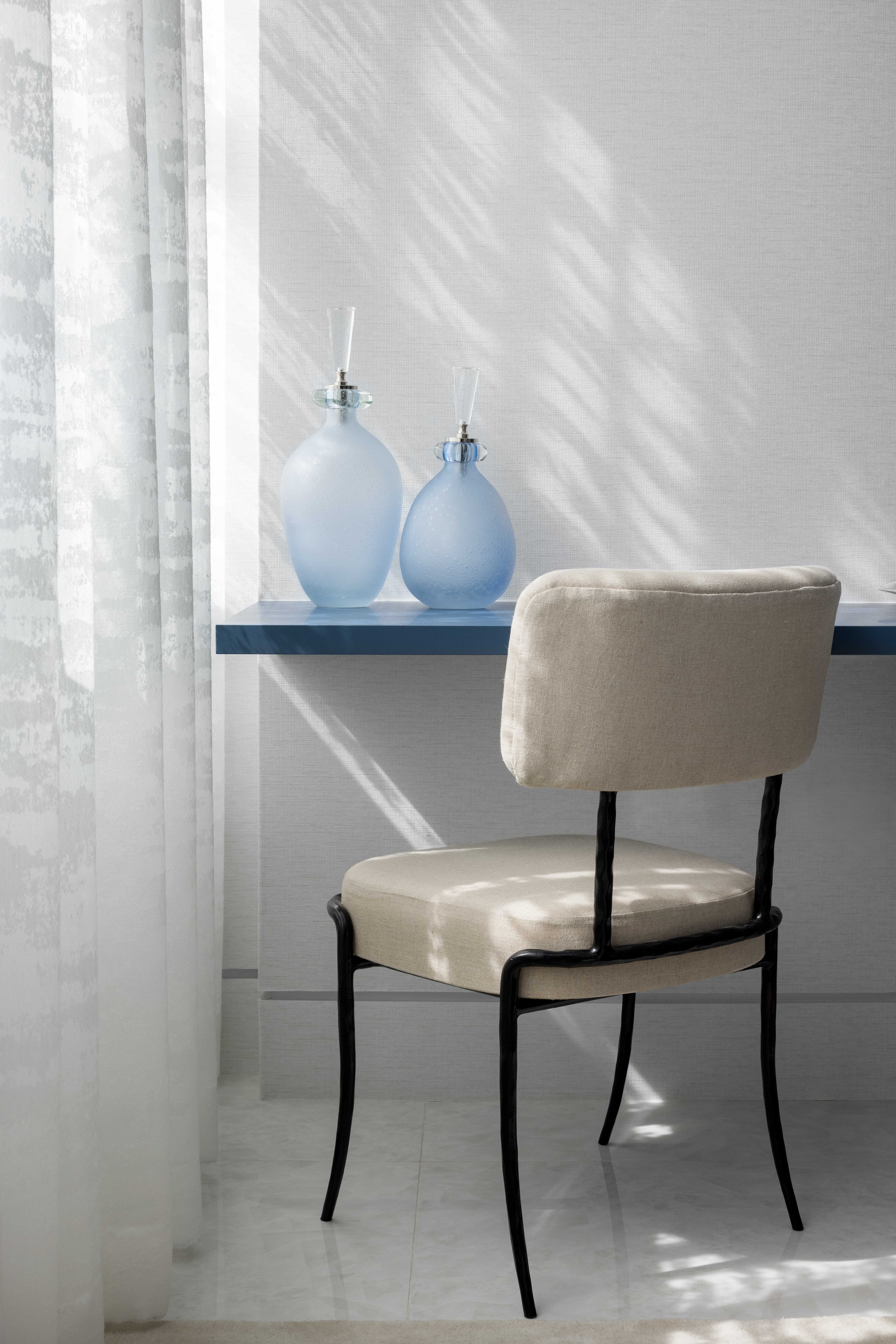
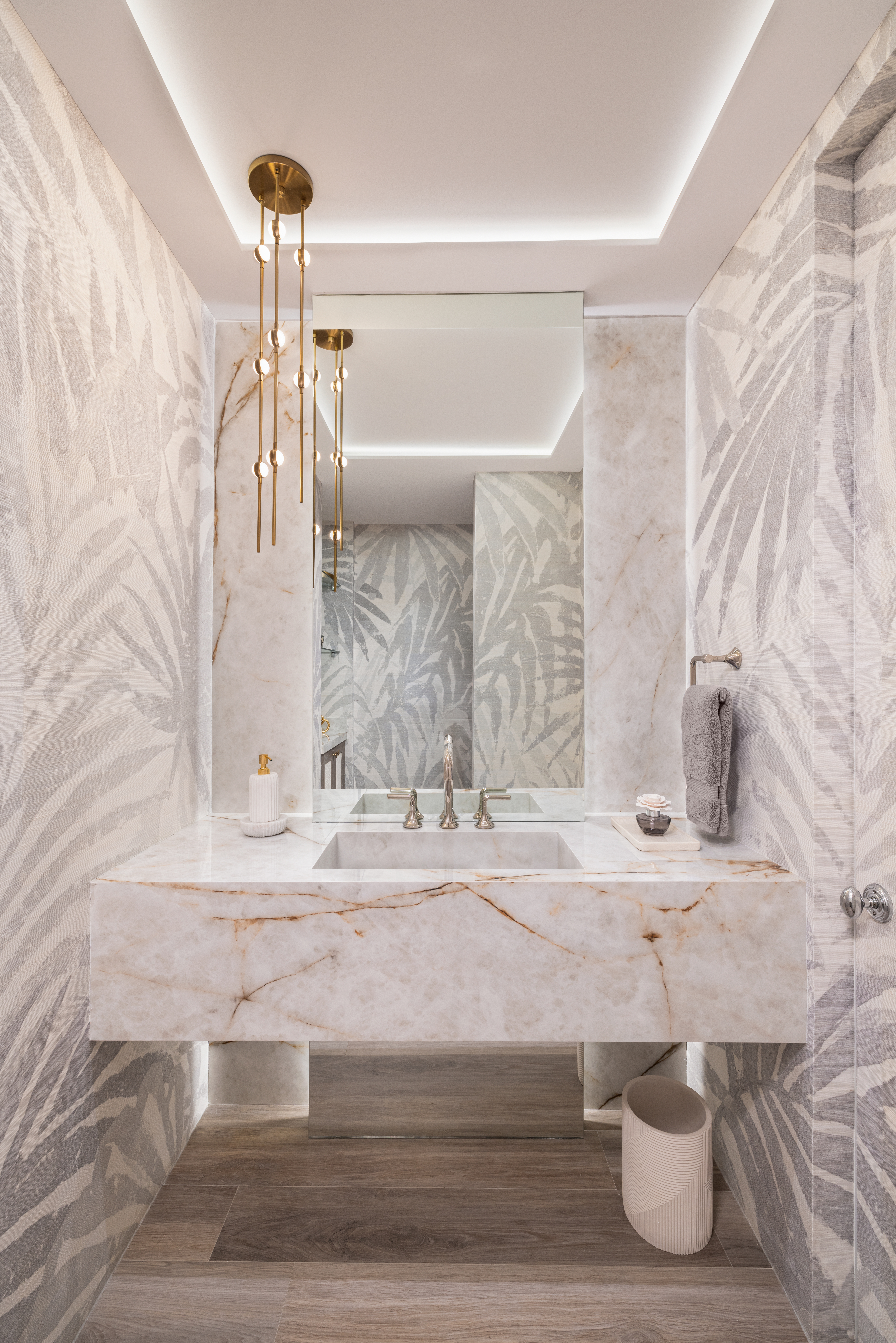
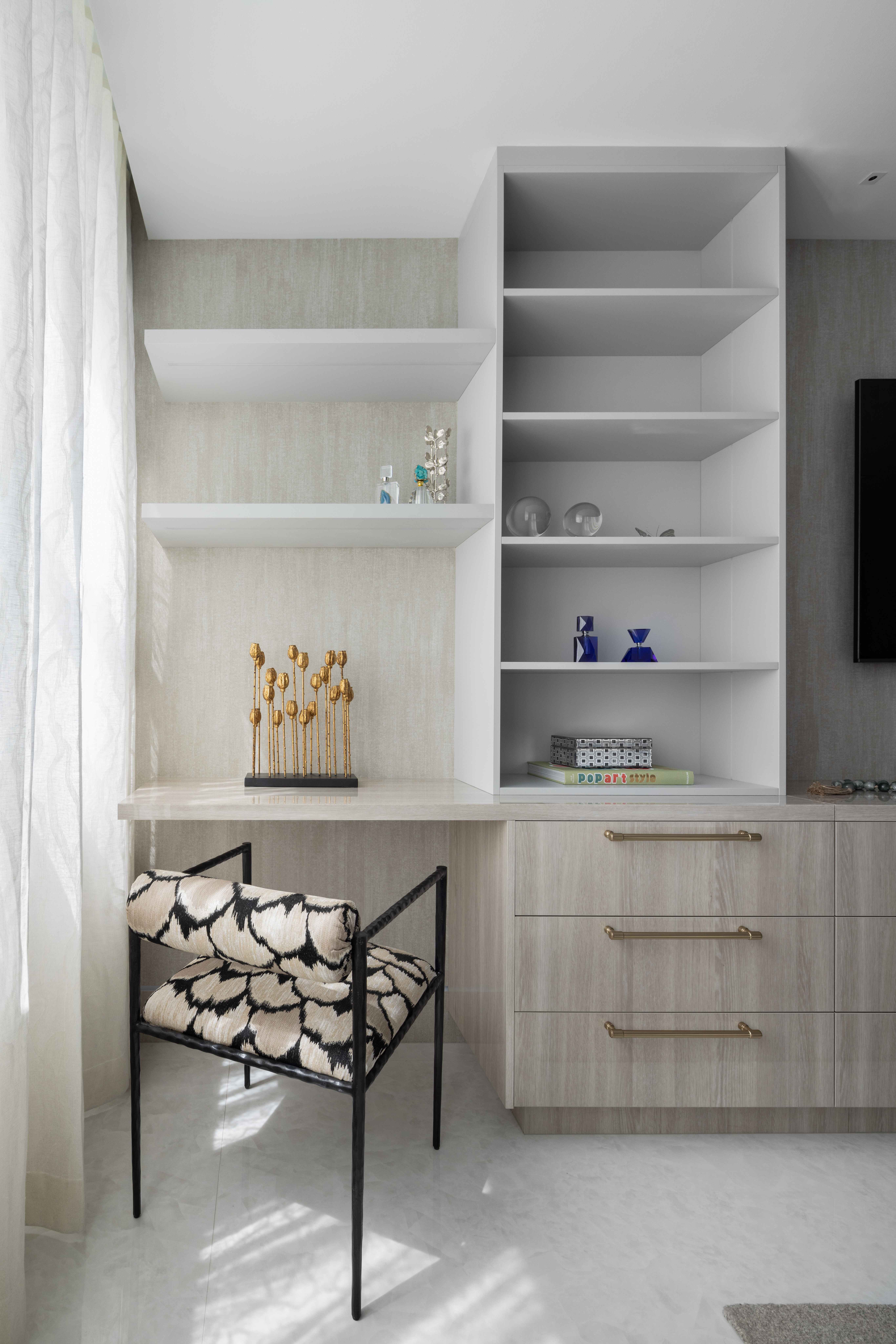
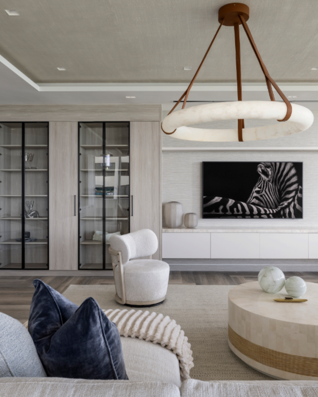
The honest answer: it is never about quantity, it is about relief. A room can be white from floor to ceiling and feel generous, as long as the eye is given texture to travel across. The rooms that succeed almost never use a single white. They use four or five, drawn from the same undertone family and separated by texture rather than by color. Chalky plaster against smooth lacquer. Heavy linen against a fine sheer. Stone, wood and ceramic each carrying their own quiet variation. The eye reads that as depth even though the palette barely moves. White becomes too much only when the layering stops, because at that point serenity tips into sterility.
Depth without color: the craft of layering
Designing with white sounds simple, and getting depth out of white is anything but. There is also a reason these interiors feel restorative rather than empty. A low contrast, low visual noise environment gives the brain less to process, which is measurably calming, as long as texture is still feeding the senses. Remove the texture and the same room reads as clinical. Holding that line is the whole craft, and it is the difference between a white home and a cold one.
Letting color in without losing the whiteness
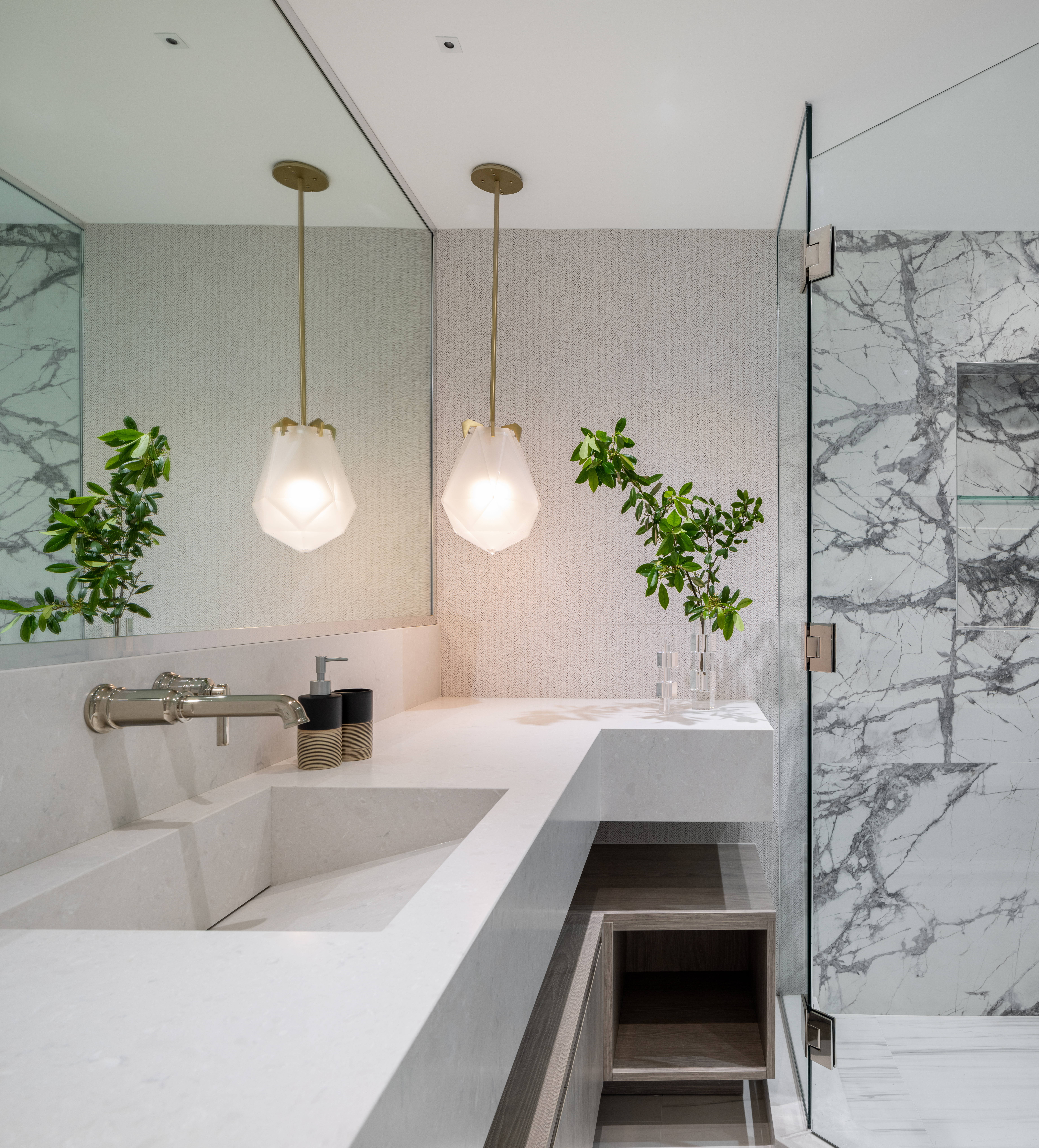
A white interior does not have to be a colorless one. The trick is to let color arrive through things that are alive or personal rather than through the architecture: greenery and organic materials, the shifting blues of the ocean beyond the glass, art, books, a single piece of aged wood or patinated bronze. Because the envelope stays quiet, each of those elements lands with far more force than it would in a saturated room. This is where white performs its most generous role. It is the reason a canvas gallery paints its walls the way it does. Against the right white, a painting, a sculpture or even a view stops being decor and becomes the event of the room.
Lighting: the material nobody sees
In a primarily white interior, lighting is not a finishing touch, it is a building material. Daylight does the first shift, which is why window treatments in these projects are engineered to filter rather than block. After dark, the room depends on layered, warm, indirect light: coves that wash the plaster, picture lights that pull art forward, lamps that pool light low and keep the ceiling soft. Flat overhead lighting is what makes white interiors look like offices. Dimension in white is made with shadow, and shadow is made with restraint.
White as the star, not the backdrop
The panel will close on the question designers love most: can white carry a room on its own? In the studio’s oceanfront work the answer has been yes, repeatedly. In the right residence, a sculpted lime plaster wall, a monolithic honed stone island or a fully upholstered white bedroom is not a neutral setting waiting for something to happen. It is the thing that is happening. And the myth Sarah would most like to retire forever is the oldest one of all: that white is boring, cold or impractical for real life. A white room done properly is none of those things. It is the most demanding brief in interior design, and when it works, the most quietly luxurious.
“A white room is never really white. It is a room built out of light, texture and shadow, and it only works when all three agree.”
SARAH ZOHAR
Event details
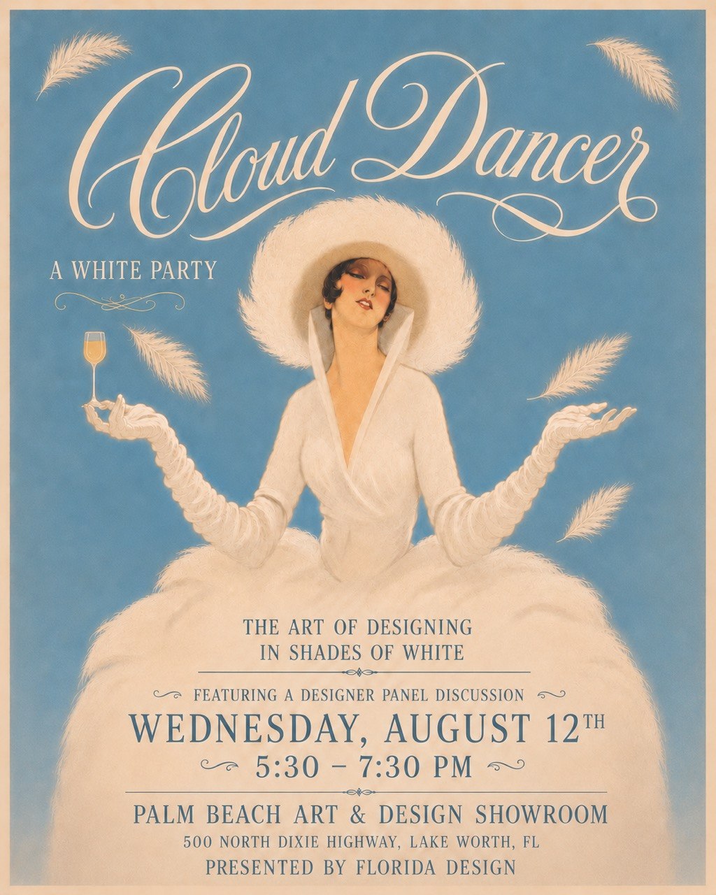
Cloud Dancer, A White Party. The Art of Designing in Shades of White, featuring a designer panel discussion with Sarah Zohar of Sarah Z Designs, Angela Reynolds of Angela Reynolds Design and Sophia Passerini of Passerini Interiors.
Wednesday, August 12, 2026
5:30 PM to 7:30 PM
Palm Beach Art, Antique and Design Showroom, 500 N Dixie Highway, Lake Worth Beach, FL 33460
Presented by Florida Design
Dress code: white
The showroom itself is worth the drive north, a 25,000 square foot space representing more than forty galleries and dealers, so the setting does a good deal of the talking before the panel even begins.
How to attend or follow along
As a specialized evening presented by Florida Design, Cloud Dancer is oriented toward design professionals and there is no public ticket link. Anyone interested in attending should reach out to the organizers directly for an RSVP. For everyone else, coverage from the evening will be shared on the Sarah Z Designs social channels and by Florida Design Magazine, including the highlights from the panel discussion.
Questions we get about designing with white
What is Pantone Color of the Year 2026?
Pantone 11-4201 Cloud Dancer, a soft white chosen for its sense of calm, clarity and fresh start. It is the first white named Color of the Year since the program began in 1999, and easily its most debated selection.
Is Cloud Dancer really a color, or just white?
It is a true color decision. Cloud Dancer carries a soft, airy warmth that separates it from stark or blue-leaning whites, and in a room it behaves as deliberately as any pigment. Calling it a non-color misses how much work a white does once it is on every surface.
What is the hardest part of designing a white room?
Matching undertones. Whites read warm, cool, green, gray or pink, and mixing opposing undertones in one room makes one of them look dirty. Choose whites from a single undertone family and let texture create the contrast instead.
Does a white palette work in a Florida oceanfront apartment?
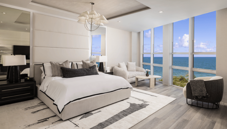
It works beautifully, but samples have to be tested in the apartment itself. Light reflected off water and pale terraces shifts a white several times a day, so a color approved in a showroom often behaves differently once it is on the wall.
How do you keep a white interior from feeling cold?
With natural materials, layered texture and warm, indirect lighting. Lime plaster, linen, boucle, pale oak, honed limestone and unglazed ceramic give the eye variation without adding color, which is what separates a serene room from a clinical one.
How many whites should one room use?
Usually four or five, closely related. A single white flattens a space, and too many unrelated whites make it feel unresolved.
Can I still have color in a white interior?
Yes, and it will look better than ever. Let color enter through art, greenery, books and personal objects rather than through walls or large furniture. A quiet white envelope makes every accent read with more intention.
The best white rooms are not empty. They are simply quiet enough to hear the light.
Explore the studio’s oceanfront projects at sarahzdesigns.com